The Painted Backdrop and the Making of Movie Worlds
Painted backdrops create screen distance and spectacle without building every street or skyline, showing how scale, perspective, and style shape a film’s world.
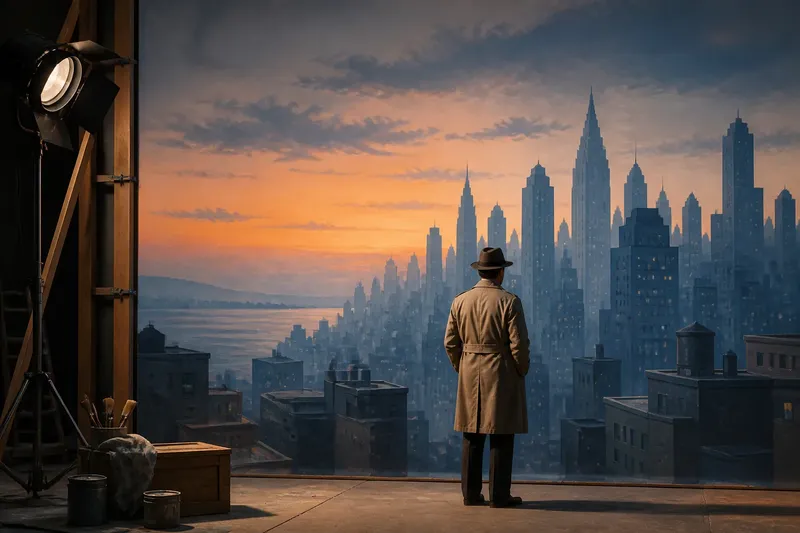
A painted backdrop can turn a studio wall into a harbor skyline without pretending the studio contains a harbor. In film design, the painted backdrop is a physical image placed in the scene; its precise construction and use vary by production. The useful distinction is between that on-set surface and imagery added through other methods, which may also be called matte painting.
Its purpose is not simply to depict a place. A backdrop can carry the film’s chosen style into the distance: a theatrical city, a storybook mountain range, or a horizon that looks intentionally too grand to be ordinary. The image does not have to pass inspection from every angle. It has to belong to the film’s visual language.
What does a painted backdrop contribute to a film’s style?
A painted backdrop gives the art direction a place to extend its shapes, colors, and degree of realism. A scene with simplified architecture in the foreground can continue that graphic treatment across a painted skyline. A more naturalistic setting might use subdued forms and softened detail instead. The relationship is expressive before it is practical.
Color can do much of the work. A cool, pale distance can make a foreground figure feel isolated, while a warm painted horizon can give a scene a theatrical glow. Those choices need not reproduce a real landscape’s colors; they need to remain consistent with the film’s intended mood and design.
Scale is expressive, too. A small figure placed against an immense painted city may seem overwhelmed by it; a dense group against the same view can make the world feel busy and inhabited. The painting establishes a visual relationship, not merely a location label.
How does a painted backdrop create a sense of depth?
Perspective gives the eye cues that forms recede: a road narrows, buildings diminish, and a mountain range becomes less distinct toward the horizon. Atmospheric perspective adds another cue by making distant shapes softer or lower in contrast. These devices can make a flat surface read as a far view, especially when the film’s style supports the illusion.
Composition also matters, but it need not make the backdrop invisible. A painted street might use converging lines to draw attention to a doorway, or a deliberately flattened skyline might keep the scene graphic and stage-like. The design question is whether the painting’s forms support the image’s intended emphasis.
Keep the distance’s detail consistent with the visual style: a crisp, decorative skyline may be a deliberate choice, not a failed attempt at realism.
Why choose a painted view instead of a complete landscape?
A production may want a particular image rather than a complete environment. A few visible rooftops, a slice of sea, or a mountain silhouette can establish the setting and carry a strong design motif without depicting everything beyond the frame. The backdrop lets the film present a composed view rather than a full geography.
That selectivity also suits stylization. A painted moon larger than expected, a geometrically neat skyline, or a horizon with a clear band of color can make the film feel like a fable or a stage performance. In that case, visible artifice is part of the effect. The painting is not failing to be a real place; it is helping the film look deliberately unreal.
What questions do viewers ask about painted backdrops?
Is a painted backdrop the same as a matte painting?
Not necessarily. “Painted backdrop” commonly describes a physical painted surface used in a scene, while “matte painting” can refer to painted imagery incorporated through other production methods. Terminology and technique vary, so the label alone does not identify exactly how a particular shot was made.
Can a painted backdrop be intentionally obvious?
Yes. A visible painted surface can reinforce a stage-like, graphic, or dreamlike style. If that quality suits the film, making the image look less painted could weaken the design.
What visual cues make a painted landscape feel distant?
Receding lines, diminishing forms, softer detail, and reduced contrast can suggest distance. A film may also use exaggerated color or simplified shapes to create depth in a more stylized way.
How can I tell what the backdrop contributes?
Look for a repeated color, shape, or motif that links the background to the costumes, props, or foreground design. Ask whether the view makes a character seem small, sheltered, or surrounded; those relationships often reveal more than trying to identify the painting’s precise technique.
How can you read a painted backdrop’s design choices?
Imagine a scene designed around a lonely traveler and a painted city in muted blue-gray, with a single band of amber along the horizon. The starting point is a composition that needs to make the traveler feel small. The art director carries the same blue-gray into the distant buildings, then reserves amber for the horizon; the expected result is a clear color relationship that draws the eye from the figure toward the city. If the film instead needs the city to feel welcoming, the designer could give the skyline warmer tones and let the horizon recede as a secondary detail. The tradeoff is emphasis: isolation in one version, invitation in the other.
When you look for a painted backdrop in a film, notice what it repeats and what it leaves out. A skyline may echo a costume color, a mountain silhouette may frame a figure, or a stylized horizon may announce that the film prefers theatrical design to naturalistic scenery. The term painted backdrop movie worlds points to that broader purpose: the image can shape the film’s visual identity, not just stand in for a distant place.